Thursday, December 26, 2013

Excellent Printing


Sometime ago, after Dr. Kalam's book, My Journey, was published, the editor of a publication in Indian languages wrote to me to tell me how much he appreciated the illustrations that I had done for the book while working on its Tamil translation. Mr. Kumaraswamy, the editor promised he would send me the Tamil edition of My Journey so that I could see for myself the excellent quality of the printing at Manjul Pulishers. I received my copy this morning and was truly pleasantly surprised at the way my illustrations jump out of the page almost as if I had actually drawn them right there. The quality of the printing is indeed sharp and excellent as you can see. The different textures and nuances of charcoal are brought out to their best and partner so nicely with the beautiful Tamil script. Now I feel my efforts in illustrating the stories have been worthwhile. Good printing does matter.


Once again I am really touched by the kindness of readers of this blog who stop to comment, write to me, take the trouble to personally meet and befriend me as well as encourage, assist, and appreciate what I do through the years. If Mr.Kumaraswamy had not taken the time to write and send across a copy, I would never have known how well my illustrations had been printed in the Tamil edition of the book.
Thank you!

Process for illustrations for the book My Journey

Thursday, December 19, 2013

Gathering Shapes at Hampi


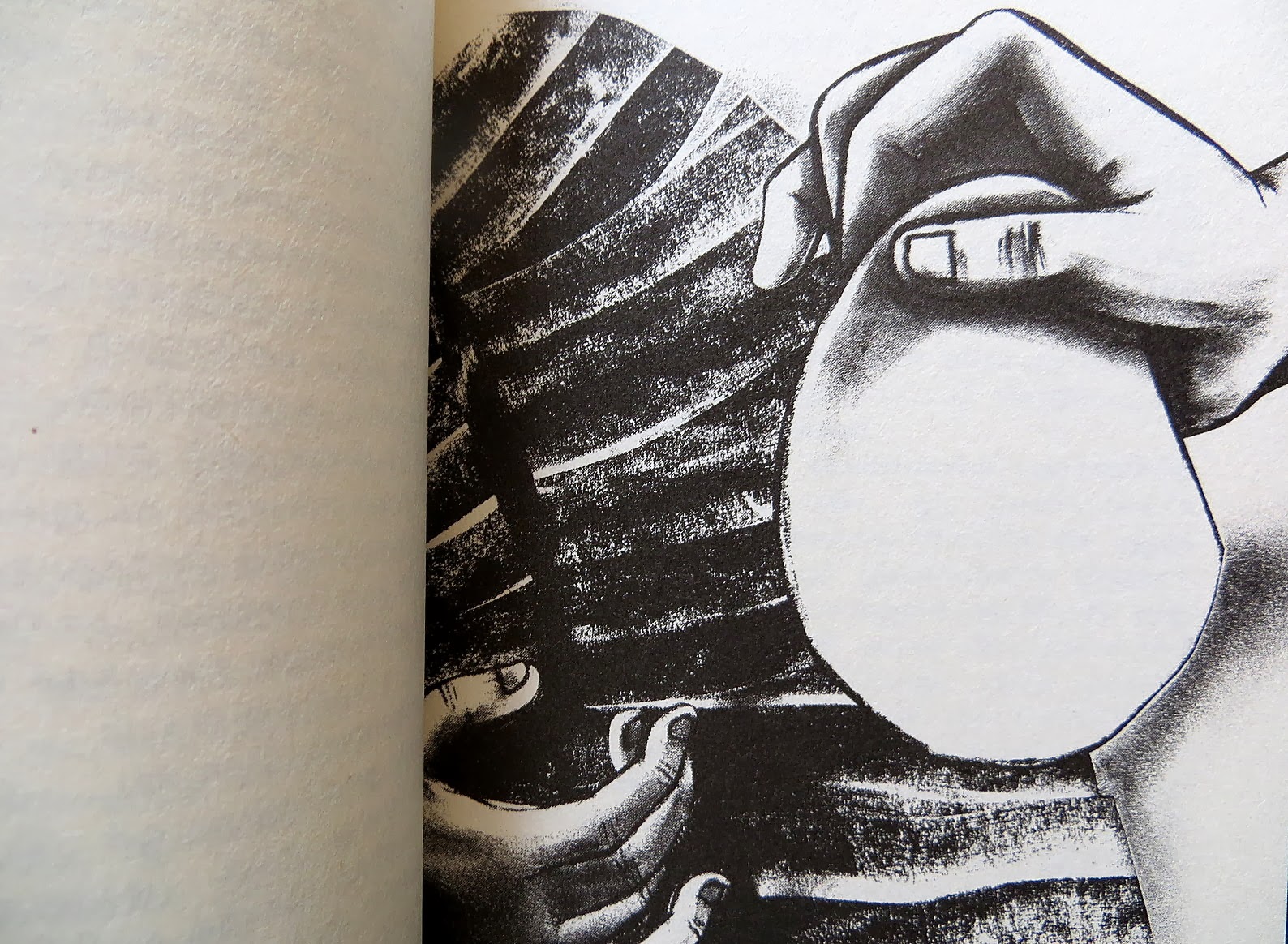
When I look at this image that I've created after my return from Hampi, I cannot help thinking how comical it is and yet so reassuring at the same time. This is my interpretation of Hampi; reassuring in its simplicity and unpretentiousness and yet simultaneously comical in the strange vibe it gives off, thanks to the kind of people who flock to the land and inhabit it - gaudily dressed hippies and English speaking villagers who intersperse its giant boulders. I had the option to either immerse myself in hippiedom or in natural surroundings. I chose the latter which is why the picture above is sans hippie.

My first visit to Hampi was over 10 years ago when it was far less touristy and when thanks to the kindness of a villager, for some fifty rupees I was taken to see all the many monuments of Hampi off the beaten track known only to locals and given one of the most unforgettable experiences of my life.
This time however, I was very clear that I wanted to relax and take a total break after hurtling from deadline to deadline for nearly the entire year and to resuscitate my brains which had been frying over the internet way too long. I did exactly that, and Hampi was the perfect place with its 'chill-out joints', natural beauty and laid back atmosphere.
I didn't take too make photographs, I didn't anxiously try to create magnificent drawings in my sketchbook, I simply ate, slept, took long walks, finished a storybook, explored shapes in my drawings and drank lots of masala chai. It was wonderful.
Here are some pictures that I'd like to share with you all -


The sweet smell of exhaled pot-fumes and lolling hippies finally calmed my anxious city-girl nerves at the Laughing Buddha, where I drew Matanga Hill while eating a delicious wood-fired pizza.


Day 2, I grudgingly clambered over to Achutaraya temple and stuffed up many attempts to capture its shape in my sketchbook. Then I got up and explored the beautiful landscape further, breathed freely in open space, drew some more and caught the last ferry back across the river.


The final day, I simply drank lots of masala chai, finished my book, swayed gently to sleep on the hammock and took leisurely walks along the river. The only tangible things I brought back with me were my drawings and these beautiful stones that I found along the banks of the Tungabadra. What better treasures could any traveller carry back?


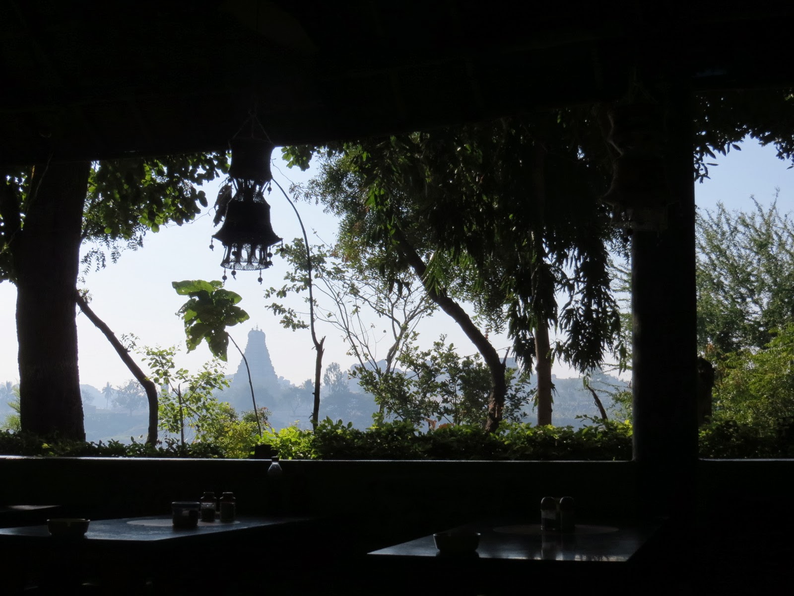
While processing my visit on my return, I remembered that I had chanced on an unusual 45-degree angle of Virupaksha temple which I had happened to glance up at while returning to the ferry in the late afternoon sun. A dark jagged curve climbed up against the sky along the left side of the temple and seared downwards in a dark trail across the centre. I drew it at home in my large Moleskine sketchbook with graphite and pastel.


Later I reminisced about the things I saw to another artist who had visited Hampi earlier. "The shapes at Hampi are different from the shapes in Bangalore" I said. My listener knew exactly what I meant. Ultimately I think that is what we artists do, gather shapes and collect them within the pages of sketchbooks. And then sometimes we interpret them in our pictures. That is what we live for.


The Journey

Tuesday, December 17, 2013

Compliments and Comments


The editors of IQ Magazine wrote to tell me that Prajwal Parajuly, the author of the story that I had illustrated, liked my illustration so much that he had 'pasted it all over Facebook'. I found Prajwal's page and saw what he had written:

The November issue of The Indian Quarterly has an extract from LAND WHERE I FLEE, my novel. One of my favorite characters in the book -- a beedi-smoking badass octogenarian Nepali-Indian grandma from Gangtok -- has been so accurately and amazingly interpreted by the artist that I want to sit down with the fascinating artist for a coffee. Notice the cigarette, the ring stretching the septum and the loose end of her sari covering Chitralekha Neupaney's head -- the uneasy marriage of demurity and brazenness...'

I don't often get appreciation from the authors whose stories I illustrate. More often than not, when the subject is women, it is typically and unimaginatively about suffering and sacrifice where I resort to the asked for formula of bent head and bleak colours. Therefore, it was wonderfully refreshing to read a story extract from Land Where I Flee and illustrate the wily Chitralekha Neupaney with her beedi, ensconced within an atmosphere of intrigue. 
I am waiting to get my hands on the book - Land Where I Flee.


*

One day, during a Google search, I chanced upon this beautiful image of a princess dancing. The artist who created that image was Clive Hicks-Jenkins, a name I was not familiar with. Some more Google searches revealed that he was a very well-known Welsh artist whose paintings on Google images had me hooked for days. 


Mr. Hicks-Jenkins also keeps an Artlog where he documents his process in creating all the many wonderful things that he does. There is always an erroneous perception that artists simply whip up their work out of thin air. But creating art is work, sheer donkey work and very few artists, caught up in the frenzy of creating, have the patience to document their usually exhausting process. Clive Hicks-Jenkins however does that and watching him build up step by step from basic to marvellous is as riveting as reading an engrossing detective novel.

A few days ago I was surprised to find an email by Mr.Hicks-Jenkins in my inbox. He had actually come over to my blog and looked through my work. Here are some of the nice things that he had to say -

First of all, I LOVE your work. Just wanted you to know that. The images for Current Conservation are beautiful. Direct, elegant, harmonious and vividly conjured.

This gorilla skull is magnificent!
But you do 'tender' beautifully too, as in those gorgeous images of boats on a dark sea.
I don't know what happened to make you disable comments. Something bad perhaps. If that's the case, then I'm so sorry. You should be fielding praise for what you do. I love it. LOVE it. Just sayin'.

Keep up the good work.

When I have Clive Hicks-Jenkins asking what happened to the comments section, I just quietly put it back.

When I read appreciation like this, I think wow and I am reminded how far I've come since the days I landed back on Indian shores with a fresh post-grad from a distant country and to a dubious family. Nobody really knew what illustration was then let alone the possibilities it could open up apart from 'diagrams' for how to sow seeds in a farmer's catalogue or pictures in textbooks for school children. I was desperate for encouragement and appreciation then, but the things we chase with anxiousness always elude us.
Enjoying and improving my drawing however, has resulted in surprising by-products. Suddenly door after door has opened up and I am heaped with praise, not Facebook likes or idiotic numbers, though I get that too, but emails from bloggers, other artists and authors, who take some of their precious time to tell me how much they appreciate my work and that they avidly follow my blog. During such moments these days, I realize that I am happy for a while and I am truly encouraged by such words, but it is also during these moments that I am also very aware of the fact that I am blessed to be given the time, the privilege and the peace of mind to draw. 
Nothing else really matters.


Friday, November 22, 2013

Living Blue


Photograph of sky (top) by Mario Mint
Living Blue, Indigo dyed Shibori stole from Bangladesh.
Water from Megan Drop Peritore

What was taking the sun so long? Scheherazade’s eyes grew dim. A wave of longing swept through her body, longing for a mystical dawn, a crystal blue sky. She yearned for its distance, its freedom. Freedom, she thought, a half-remembered dream wrapped in blue silk. That was the moment that Scheherazade fell in love with the color blue.She had placed Sinbad in the midst of blue, an ocean of turquoise and ultramarine, dazzling, endless. In her mind she became a pebble sunk in shallow water, falling under its spell, watching the sunlight spangle Sinbad’s skiff as he escaped this mundane world once more. To her mind came the hint of a story. Like Sinbad, she would follow the ebb and flow of that story.

The City of Brass
~ via Parabola Magazine

Living Blue


Saturday, November 16, 2013

The Name's Bond, Ruskin Bond


The publishers wanted a cover illustration that was mature and which would appeal to both adults and children alike. They felt my style would be appropriate for this.
Later, the art director, woman of few words, actually wrote back to tell me how much 'everyone liked the cover illustration'. And people are still 'liking' it on my Facebook page as I write this.
As always I am bewildered during moments like these. This cover illustration was a breeze to do after assignments like doing the illustrations for Dr. Kalam's book and coming up with all kinds of strange illustration solutions for the complex articles at Current Conservation magazine.

By the way, the design for this cover was a given template around which I had to base my illustration as well as draw a 'motif' that gets incorporated into the O.


I have decided to permanently remove the comments section from my blog for reasons which are too many to explain. For those of you who want to get in touch with me, my email is always there for you :-)

Sunday, November 10, 2013

Fish Matters

Representational drawing is not the point. The real point of drawing is how to engage in what is real...The path by which you arrive at an understanding is the whole point of the game.


My illustration for the latest issue of Current Conservation -

Sunday, October 6, 2013

Illustrations for Current Conservation Magazine

Every person who draws knows that there are two kinds of audiences – the cultured and the philistines. One never ever knows who will fall into which category until remarks are made about art.

Long ago, at the recommendation of a well wisher, I took my spanking new portfolio of illustrations enthusiastically to the big boss of a newspaper. The man's family had owned the newspaper for decades, he reeked wealth within his wood panelled room. The boss flipped through my portfolio politely and a trifle disdainfully declared, ‘who wants this sort of thing ya?’ Then he called an editor and said dismissively, ‘give her an article to illustrate’. I illustrated the article, I got paid many months later and that was all there was to it.

Fast forward to over a decade later, I went to meet the editor of an environmental magazine at the Indian Institute of Science campus. I was directed to a modern building full of light and air; the scientist who was editor of the magazine spoke very knowledgeably about illustration; he said he wanted the magazine to be a ‘platform for illustrators’ and he stated that the editors of the magazine ‘would like to build a relationship with the illustrators’.

The newspaper from years ago has over time reduced itself to a sensationalistic rag. As for the environmental magazine, when one looks at the content, the design, the quality of the printing and the visuals, the vision of the editors is apparent. 


The process for one of my illustrations can be seen over here >>>